An ode to commode design
A quick example regarding the importance of affordances and the gulf of execution in design. Examples can be found in all sorts of places.
Every so often I tweet examples of bad or questionable usability on my personal Twitter account, as well as UB HFES student chapter account (search #ubNEM). Last week I tweeted a picture of a toilet flusher taken in a restaurant that might seem a little confusing to use:
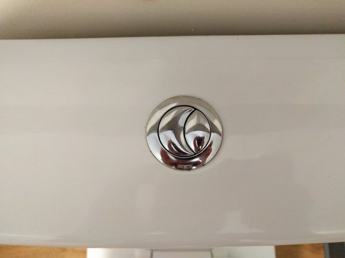
This sports two buttons, a taller-but-thinner button (which we’ll call “#1” here) shaped like a crescent, and a shorter-but-wider button (our “#2”) shaped like a cat’s pupil. One of these buttons allows for a flush using less water, while the other allows for a “full” flush. But which one is which?
Note: There’s a plot twist here as well. Scroll to the bottom to find out what it is!
To some who may have used this style of flusher before, the answer is obvious: the smaller button #2 is the water saver, while the larger button #1 is the full flush. However, this depends on knowledge in the head, which users have to accumulate through user manuals, experience, word-of-mouth information sharing, or some other means. This can be contrasted with knowledge in the world, which is information about an object’s function or usability that’s embedded (through text, pictograms, or affordances: perceived or actual properties of the object that try to indicate how to use it) in the world.
Both of these strategies have their benefits and detriments. For example, users relying on knowledge in the head are often faster at information retrieval tasks, but the information retrieved is susceptible to incorrect recall. On the other hand, knowledge in the world can help new users accomplish unfamiliar tasks that rely on information acquisition or experienced users ensure accurate performance of complex tasks, but interpreting this information can take longer and may be more susceptible to adverse environmental conditions. Good task design accounts for these tradeoffs and structures tasks accordingly.
Given the simplicity of the task and that restaurant patrons are perhaps more likely to be new than returning users of this toilet (and given that this is an infrequently-seen flusher design that seems far from standardized – one of Don Norman’s last-ditch strategies for fighting poor design), there should be adequate knowledge in the world to help a new user figure out which flusher to use based on their intent (to save water or execute a full flush). Absent more information, I think this flusher’s designers assumed that new users would look at the design and intuit which one to use.
Here we find the gulf of execution: do the actions provided by the system match those intended by the person (Norman, The Design of Everyday Things, p. 51)? The user should be able to execute their intended action directly, without guesswork. Users unfamiliar with this flusher design may not be able to do so. Knowledge in the world helps users cross this gulf by conveying which of their intended actions can be accomplished by the different components of the interface. If users cannot cross this gulf, they commit errors with the device and fail their intended task. That’s obviously not what we want as designers.
So, absent clear visual indication relating intentions with system functions, users must successfully intuit them by correctly determining how the sizes of buttons #1 and #2 correspond to water usage. A clever user may be able to do so, but designers should never assume this from their users. We have to help all users cross the gulf of evaluation successfully and without struggle.
I feel that this gets closer to a successful design of the dual flusher:
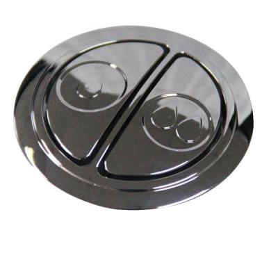
One of the major drivers here is the text-free iconography: two water droplets is more than one, so it’s likely that the cross-user and -cultural implication is that more water is used by depressing that button. Furthermore, depressions into a flat surface usually signify something pushable, rather than the raised buttons on the first design. As further design recommendations, I might suggest a difference in sizes between the partial- and full-flush buttons, as well as increasing the number of water droplets in the full-flush button from two to three to emphasize the difference. This might be considered a type of dual encoding, where information is being represented with both size and iconography; while this practice is usually frowned upon where visual real estate is at a premium, I think the redundancy here can help more users cross the gulf of execution.
Finally, I might suggest keeping the straight-line split between the two buttons to help ensure clarity regarding which buttons are larger or smaller. This may be challenging to understand when buttons begin curving into one another, as we see in the original design.
I’m not a professional usability engineer, so there may be better designs out there. Let me know if you think you’ve found one!
Oh, and the plot twist: that restaurant flusher was either manufactured or installed incorrectly, because button #1 (the larger one) was actually the partial-flush! So not only was it difficult to understand, it also failed to follow its own convention.